Features
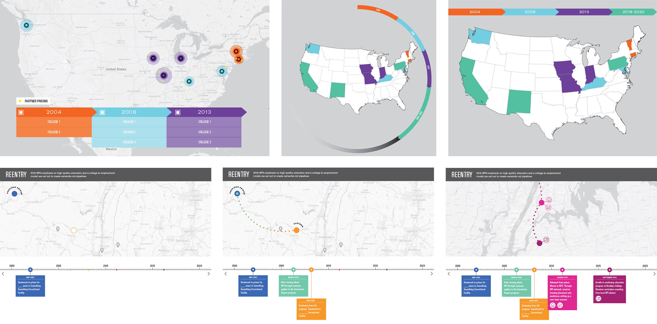
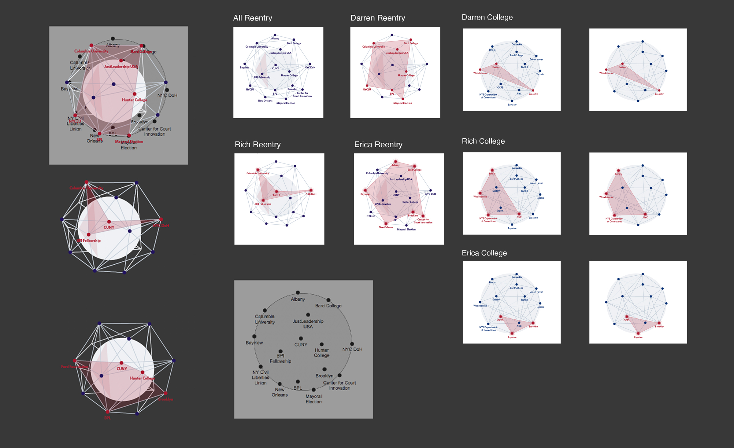
The main conceptual and visual device is a constellation of connected location points that roughly correspond to the geography of the New York State region and New York City.
Users have multiple ways to interact with the constellation points and choose how they progress through each story.
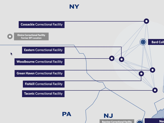 Hovering over a prison location reveals various BPI course and student statistics.
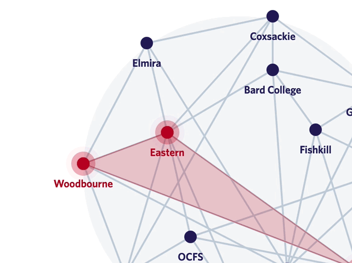 Hovering over constellation location points allows for navigation and explore key moments of a students story.
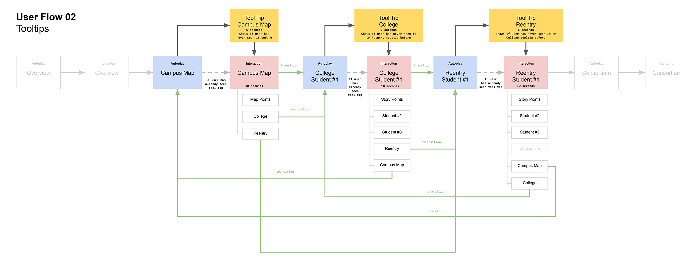
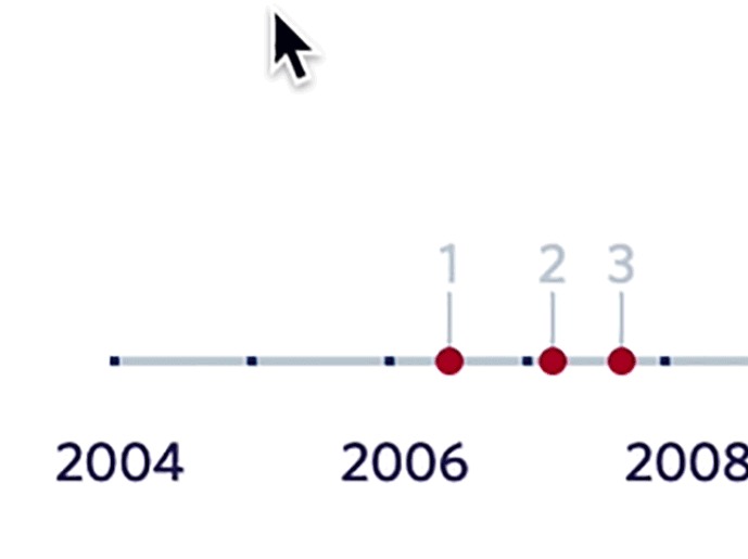 A timeline allows for a more linear, chronological exploration, with numbers corresponding to the list under each location.
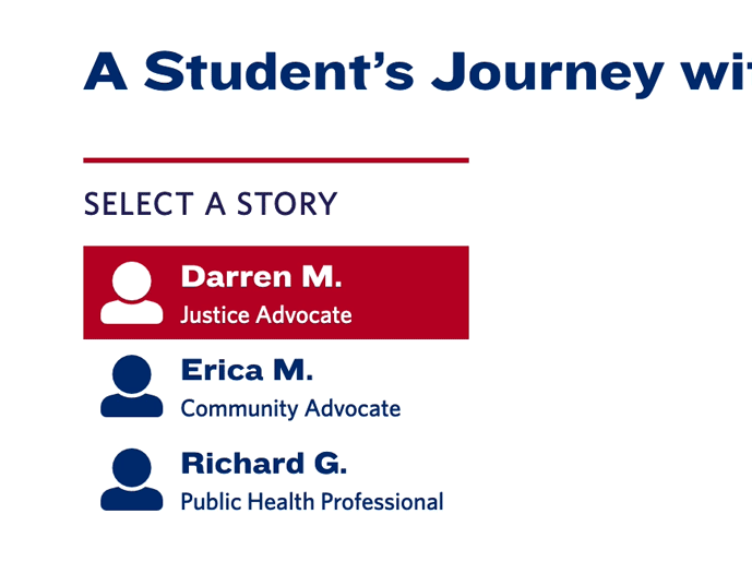 Choosing a different student enables users to explore and interact with the corresponding story points.
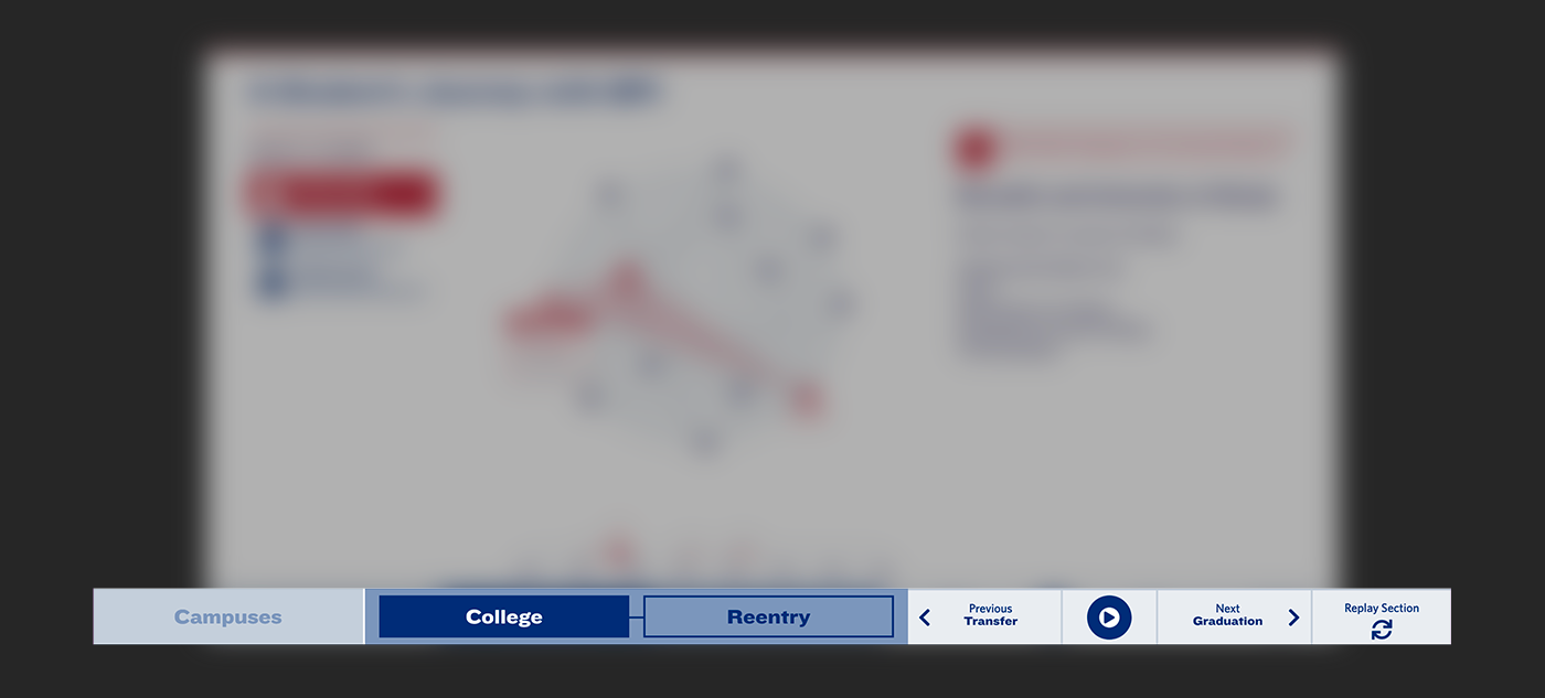
The bottom UI features two forms of navigation: on the left, menu buttons allow the user to switch between the three content sections (Campuses, College, and Reentry); on the right, slide show controls enable navigation through the story points within each section.
Research
The project involved extensive collaborative research. Over the course of the project, I gathered inspiration, edited content, mapped out user flow diagrams, and created sketches.
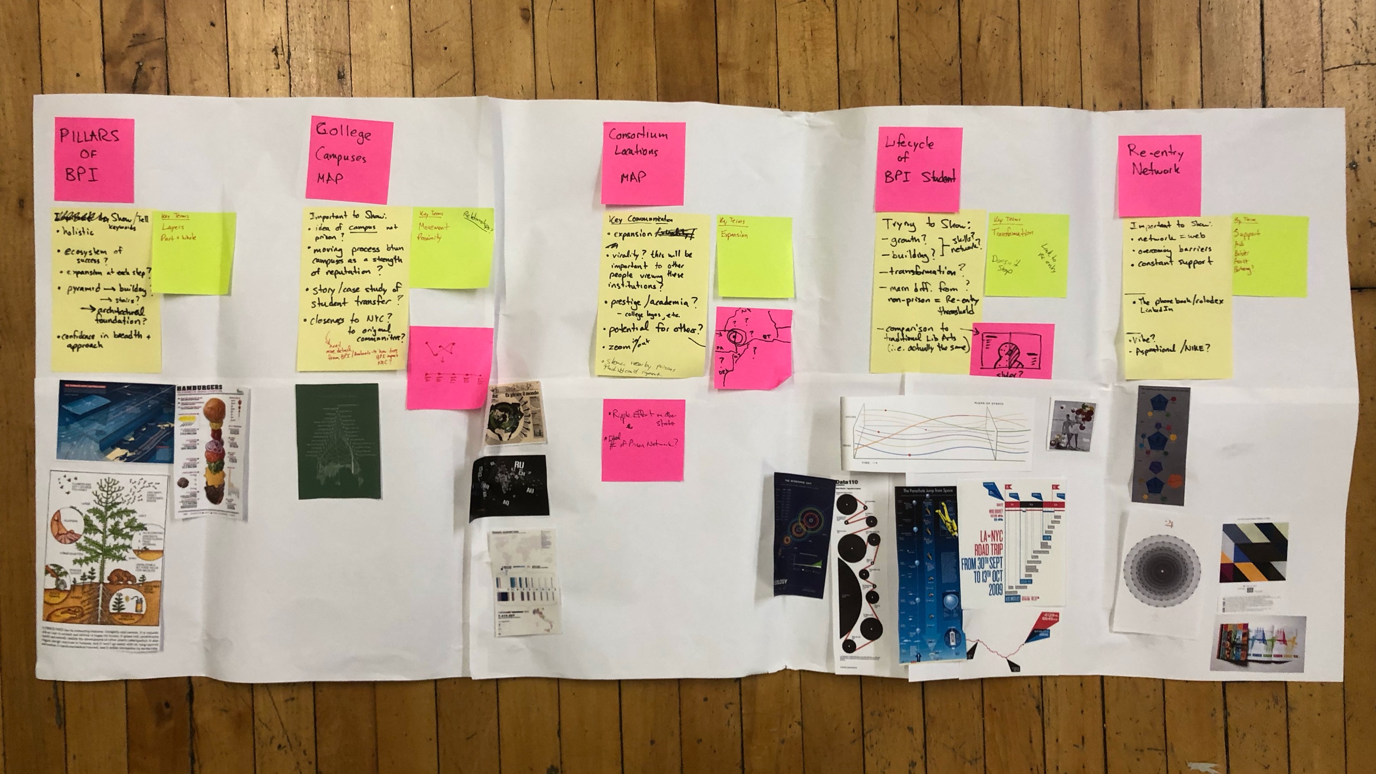 Starting visual research was an active, physical process. Notes, sketches, and references helped me begin to organize the stories to tell and strategies for telling them.
 I explored a few ways to show the national reach and influence of BPI’s education model, although this section of content was eventually dropped from the final graphic. Before we had any detailed data on students and their interactions with BPI, I sketched out how timelines, maps, icons, and the movement of fictional students from campuses to various boroughs in New York may work together with user interaction to tell a full story.
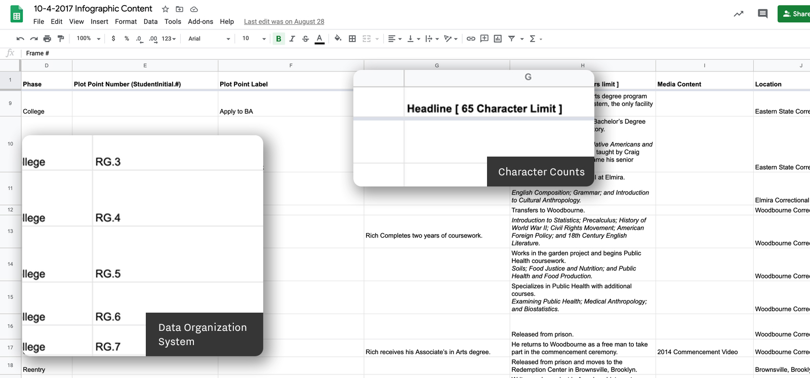 Once the client had provided several student timelines, I organized and edited the data for each event into distinct content areas that would used to make the overall graphic. I also initiated conversations with both the developers and animators to iron out and narrow down options for the user experience.
 I translated these conversations and meetings into detailed user flow maps so that all team members understood and could visualize how the graphic would need to work.
Production Process
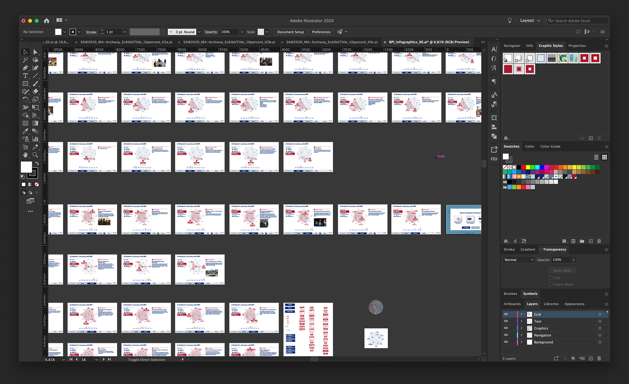
My main role was to expand wireframes and storyboards into a working prototype and eventually the main artwork files.
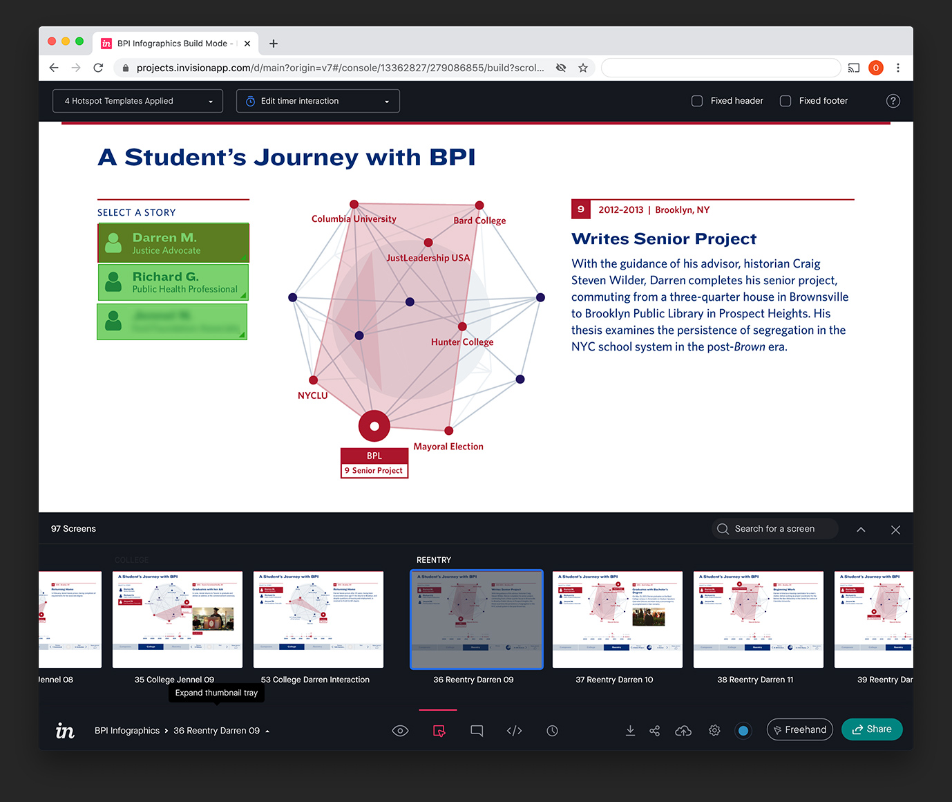 We used InVision to test out the concept and present it to the client as a proof of concept.
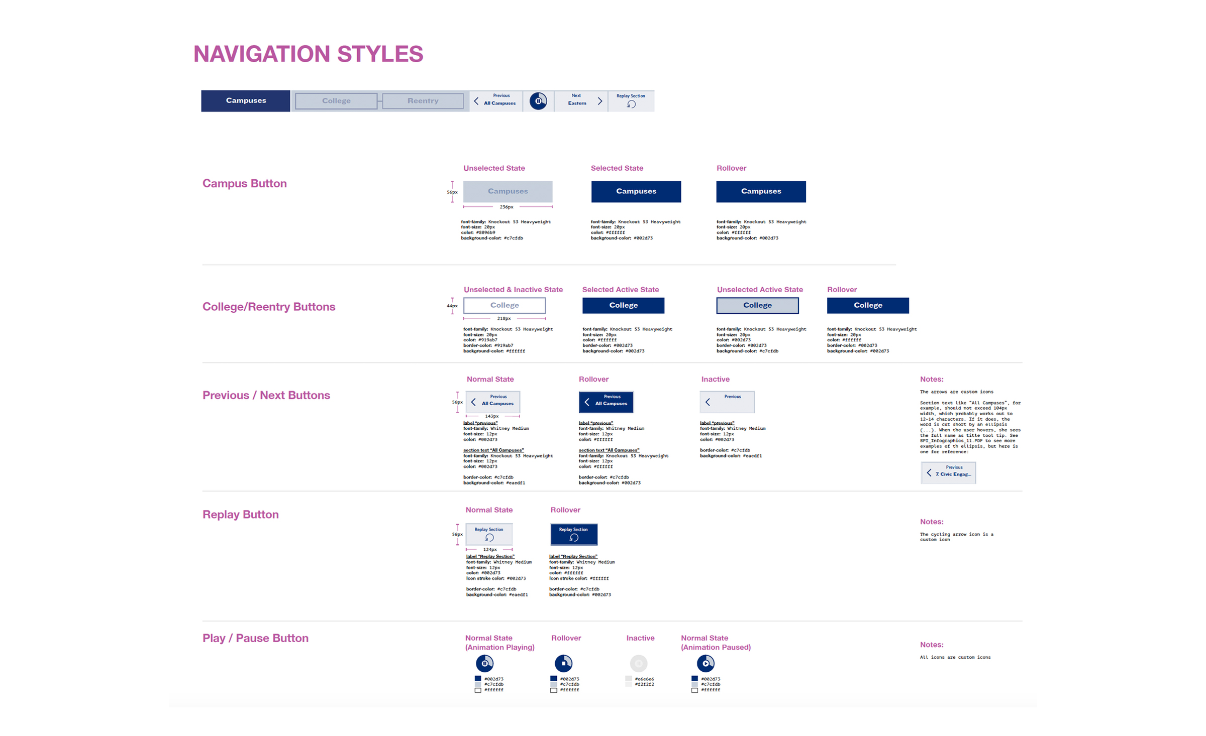
 Later, I created a detailed style guide as well as artwork for every story point to aid the digital animators and developers in creating the final product to precise specifications.
Other Roles
As part of a small team that was juggling multiple clients and projects, I had to step into other roles over the course of the project in order to keep it moving on the right track.
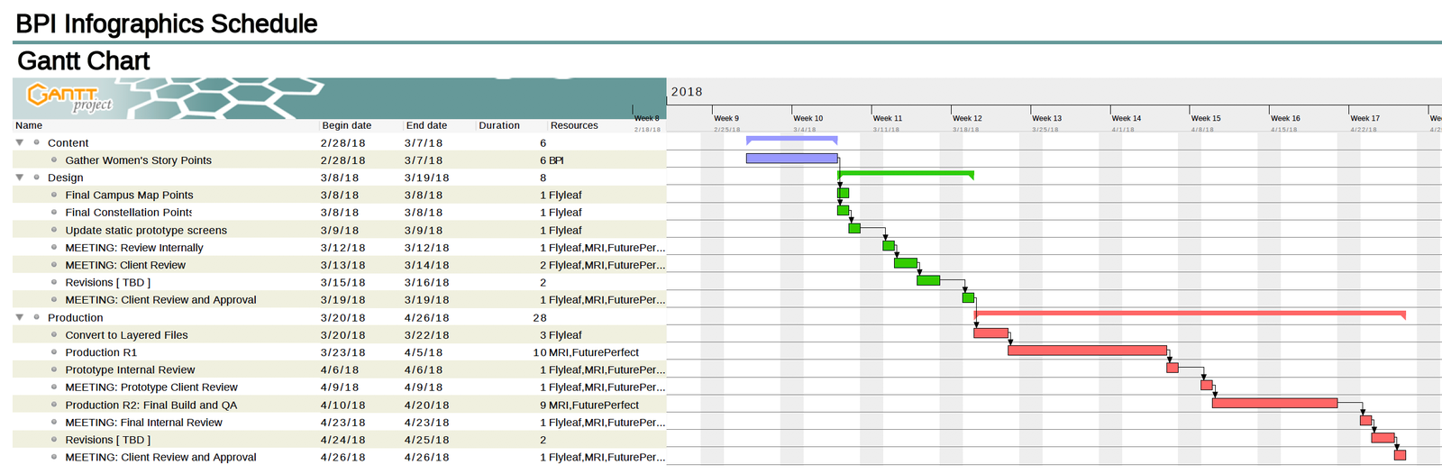 Additional roles included project management (I used a free tool called Gantt Project)
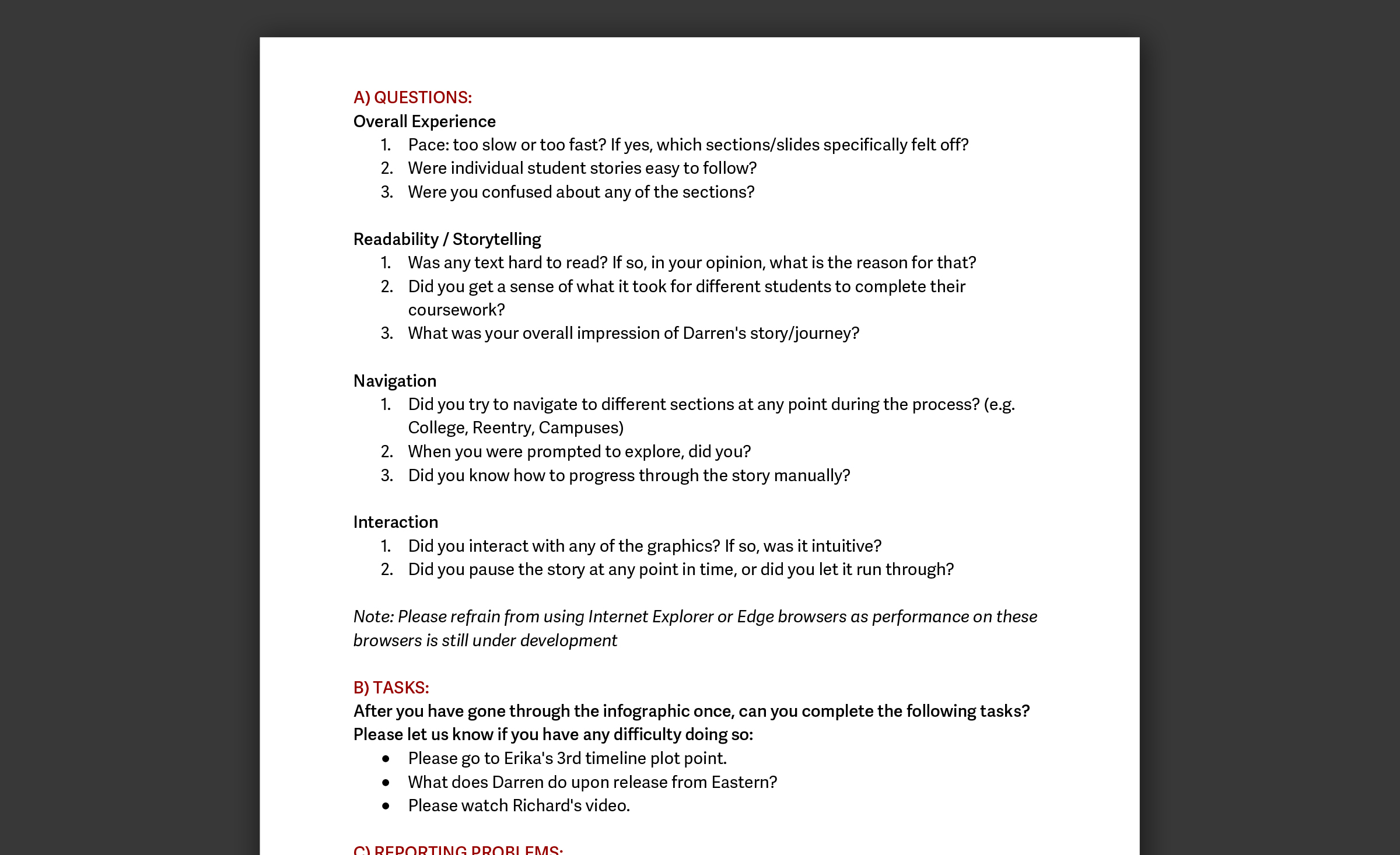 I also drafted user testing documentation.
Applications
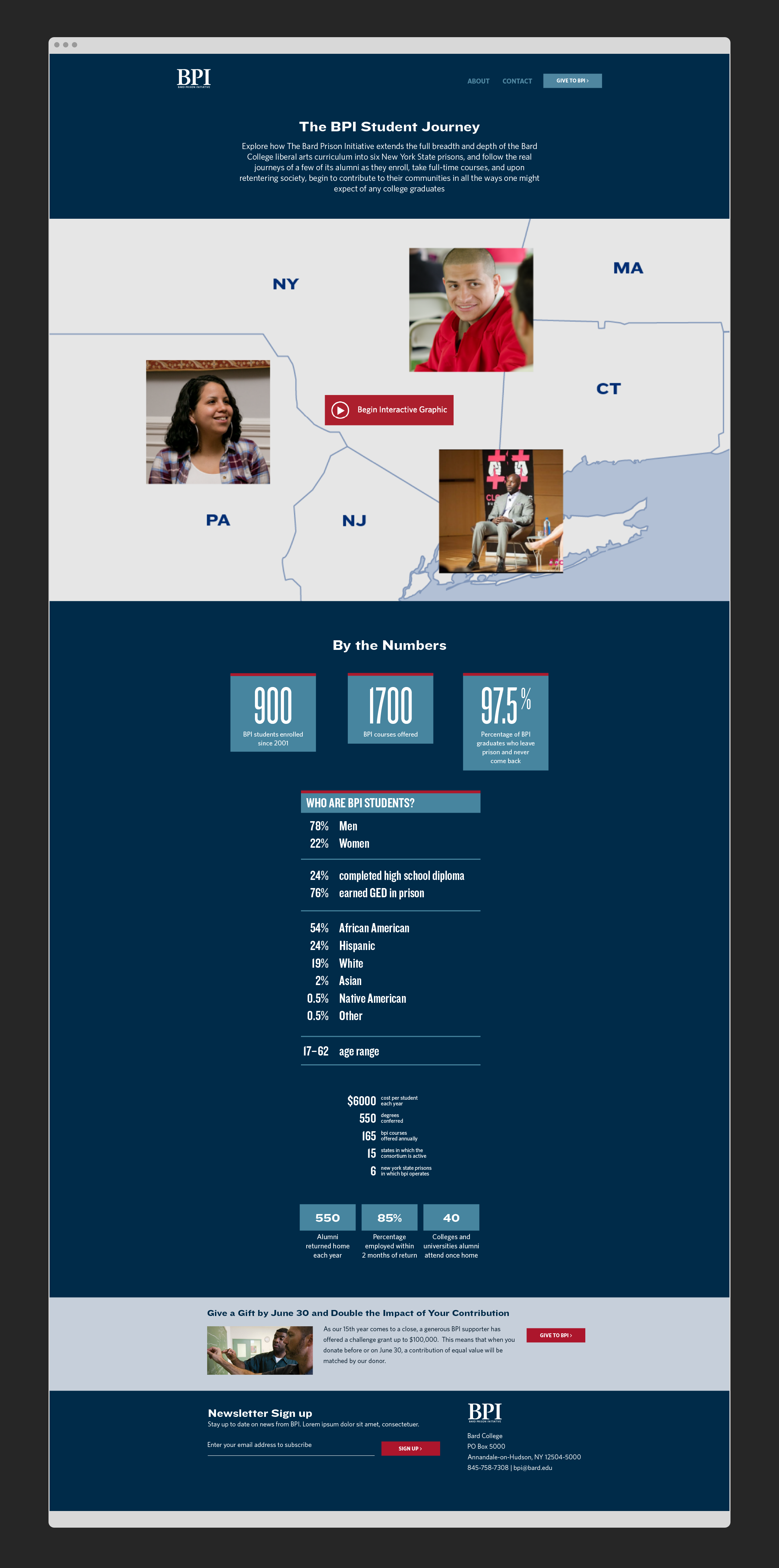
The final graphic lived on BPI’s old website (archived). In the course of developing and conceptualizing the graphic, both our team and the client started to realize just how powerful of a visual aid something like this could be. In the future, we envision the graphic living in multiple places, devices, and contexts. It can be expanded in functionality and depth of content to present a truly dynamic view of the impact of BPI and its alumni.
 Concept for a landing page.
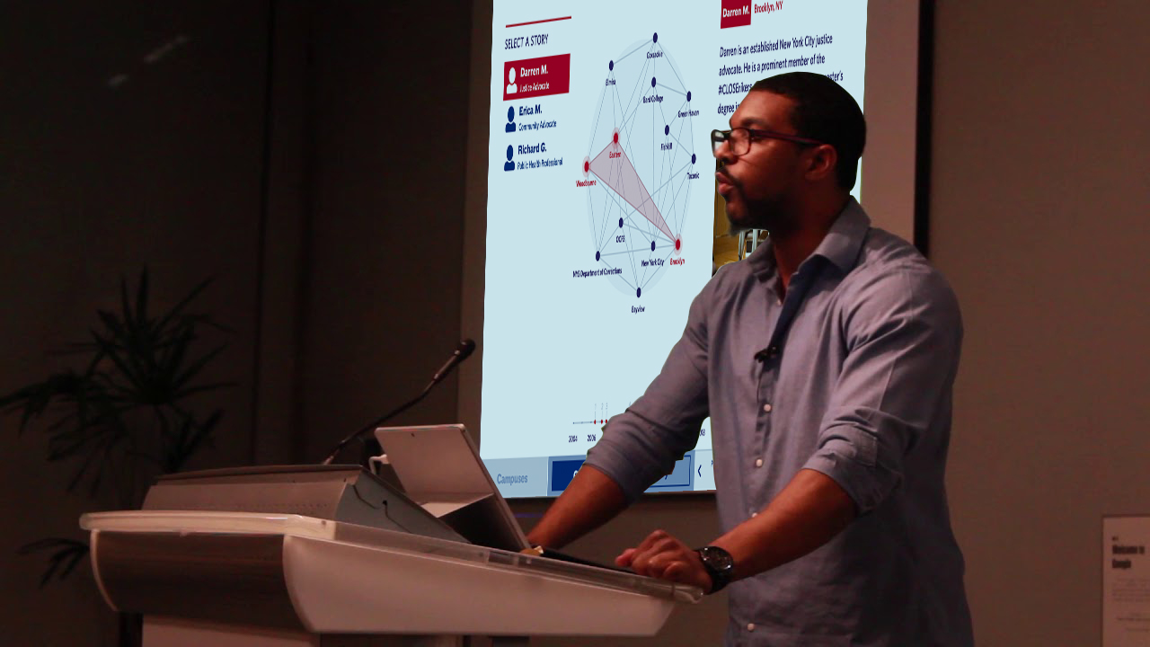 Concept: BPI Alumni and staff could use the graphic in presentions.
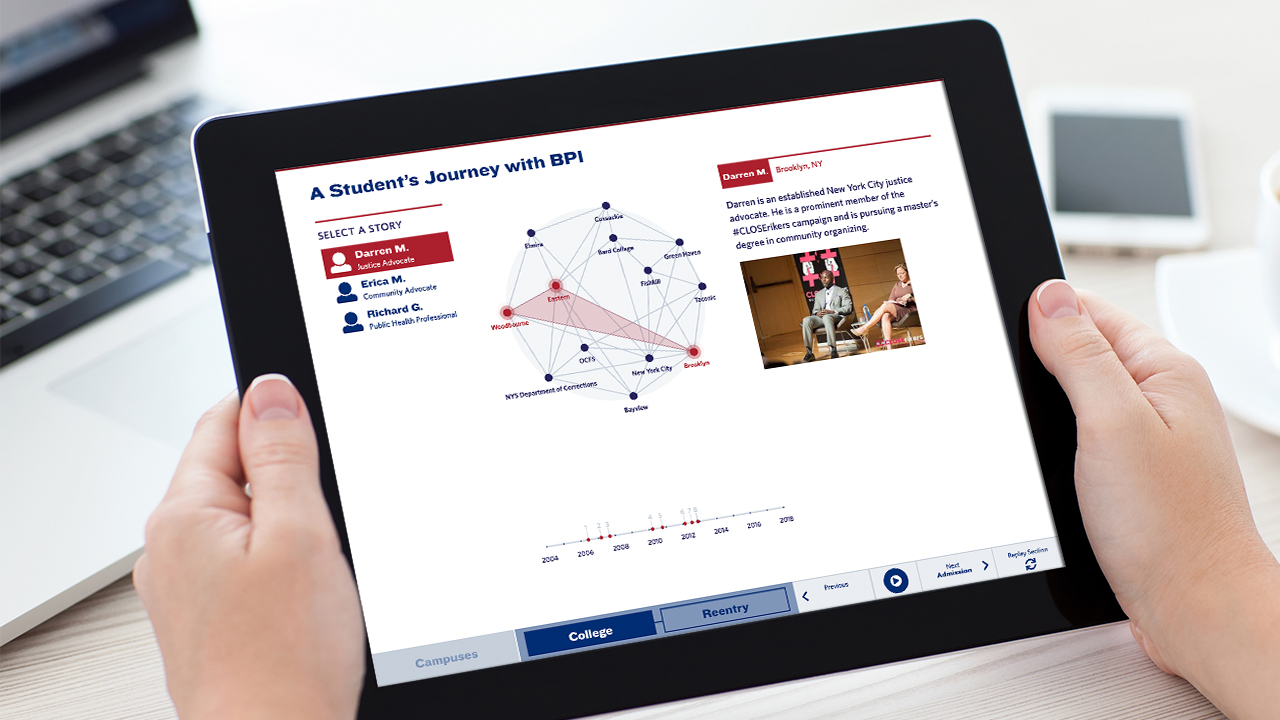 Concept: Target specific BPI followers, donors, or academics through design and distribution of a mobile or tablet version.
Next Steps
In addition to various presentation formats for the graphic, I have some interesting questions and features I hope to pursue in the future: How can we add more students as needed? What can a content management system look like in order to modify, add, or delete data points? Can we fully integrate other forms of media (audio interviews, video clips, podcasts, etc.) to enhance the experience for viewers?