BARD PRISON INITIATIVE
Interactive Infographic
Research + Visual Design ︎︎︎ 2018
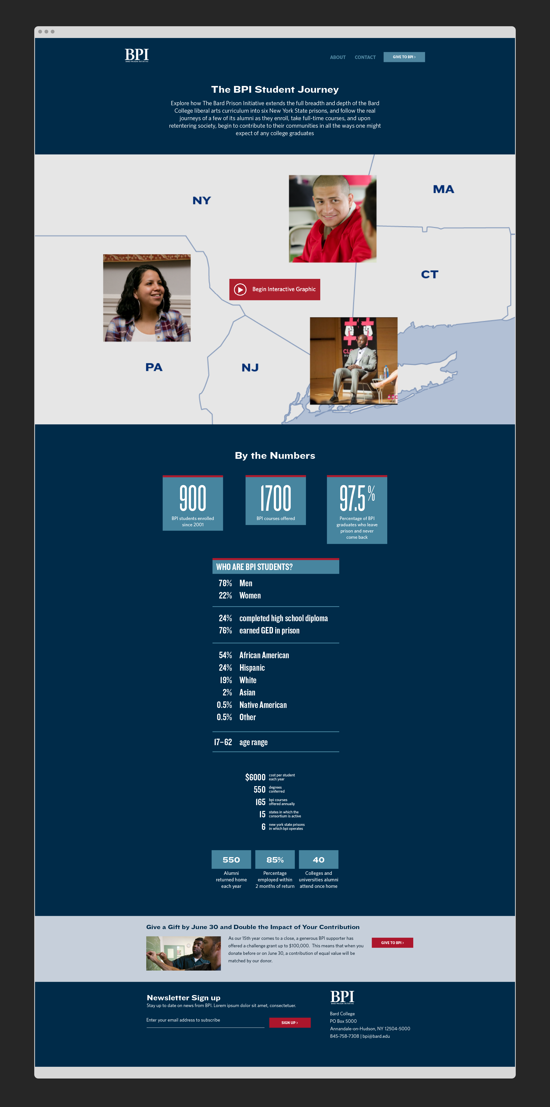
The Bard Prison Initiative began as a pioneering college-in-prison program 5 years after the 1994 Crime Bill took away federal funding for incarcerated students. As part of a website redesign, BPI needed a visually engaging way to show the deep institutional reach of its work — the campuses the BPI operates in, the rigor of a Bard college education, the support offered to students during reentry, and the alumni network and job placements that support them in becoming leaders and activists within their home communities. I researched, prototyped, and designed an interactive infographic which follows three real BPI students over several years from the time they apply to their activities, jobs, and lives well after they are released from prison.
Completed while at:
Flyleaf Creative
Collaborators:
FuturePerfect.tv , Antonio Aiello and Medium Rare Interactive
Live Site:
bpi.bard.edu/who-are-bpi-students
Flyleaf Creative
Collaborators:
FuturePerfect.tv , Antonio Aiello and Medium Rare Interactive
Live Site:
bpi.bard.edu/who-are-bpi-students
Features
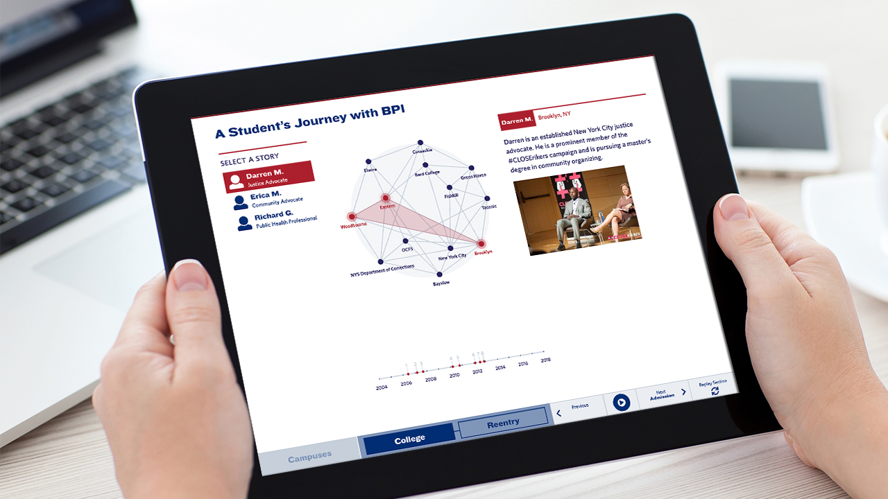
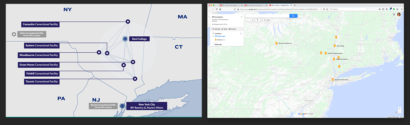
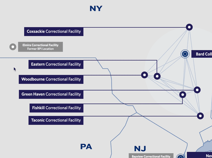
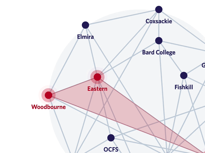
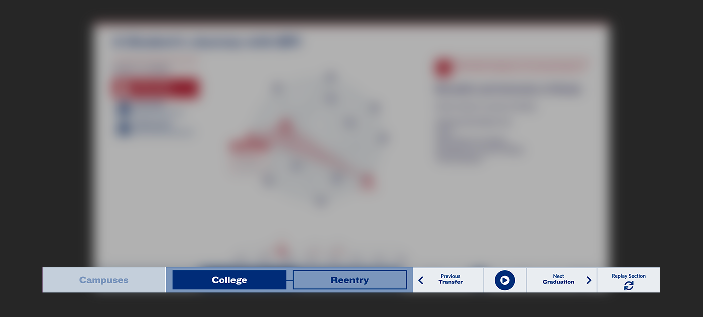
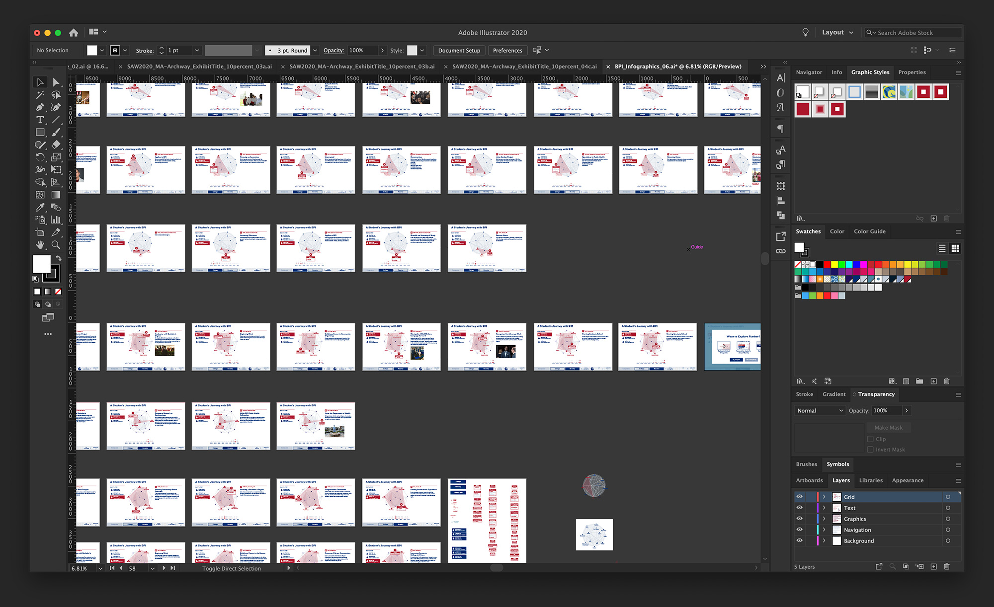
The main conceptual and visual device is a constellation of connected location points that roughly correspond to the geography of the New York State region and New York City.

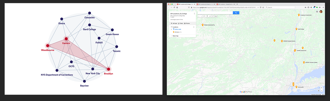
Users have multiple ways to interact with the constellation points and choose how they progress through each story.
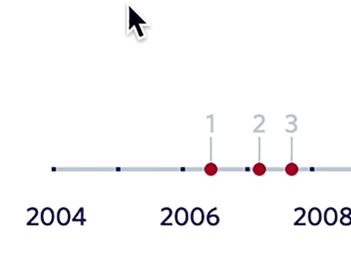
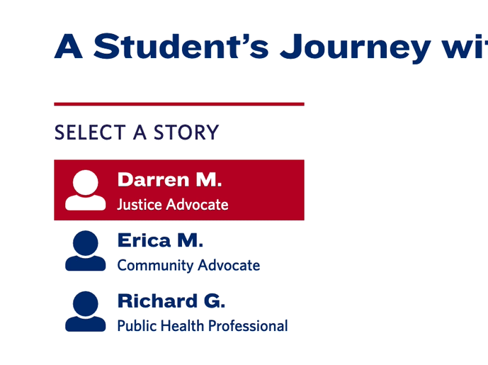
The bottom UI features two forms of navigation: on the left, menu buttons allow the user to switch between the three content sections (Campuses, College, and Reentry); on the right, slide show controls enable navigation through the story points within each section.
Research
The project involved extensive collaborative research. Over the course of the project, I gathered inspiration, edited content, mapped out user flow diagrams, and created sketches.

Starting visual research was an active, physical process. Notes, sketches, and references helped me begin to organize the stories to tell and strategies for telling them.
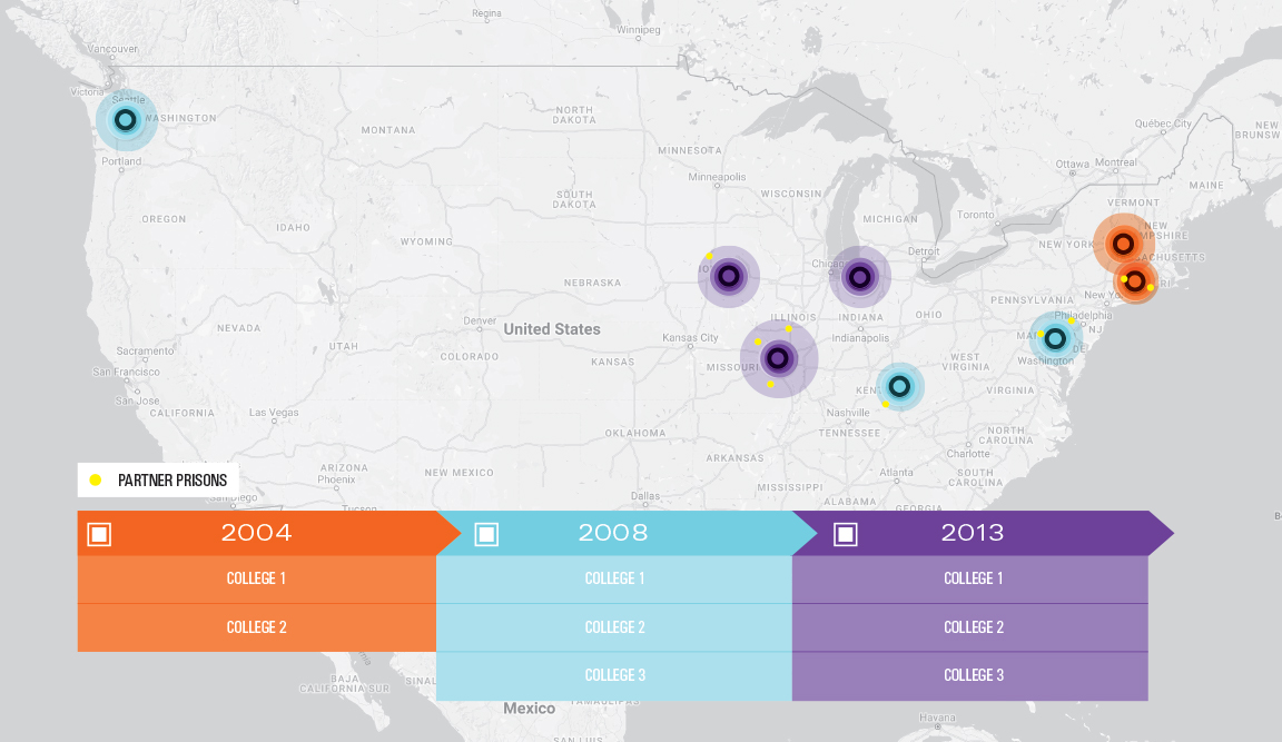
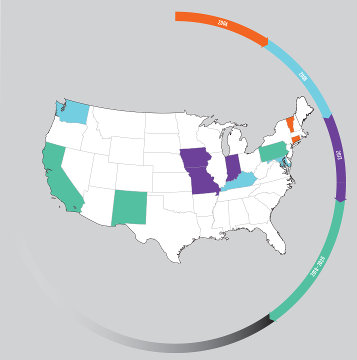
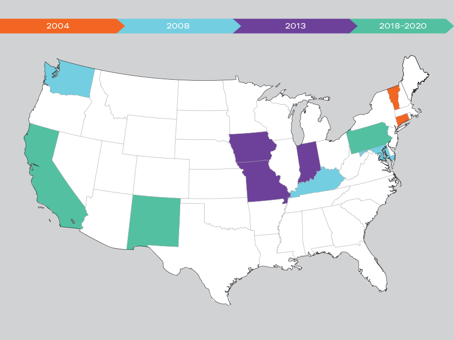
I explored a few ways to show the national reach and influence of BPI’s education model, although this section of content was eventually dropped from the final graphic.
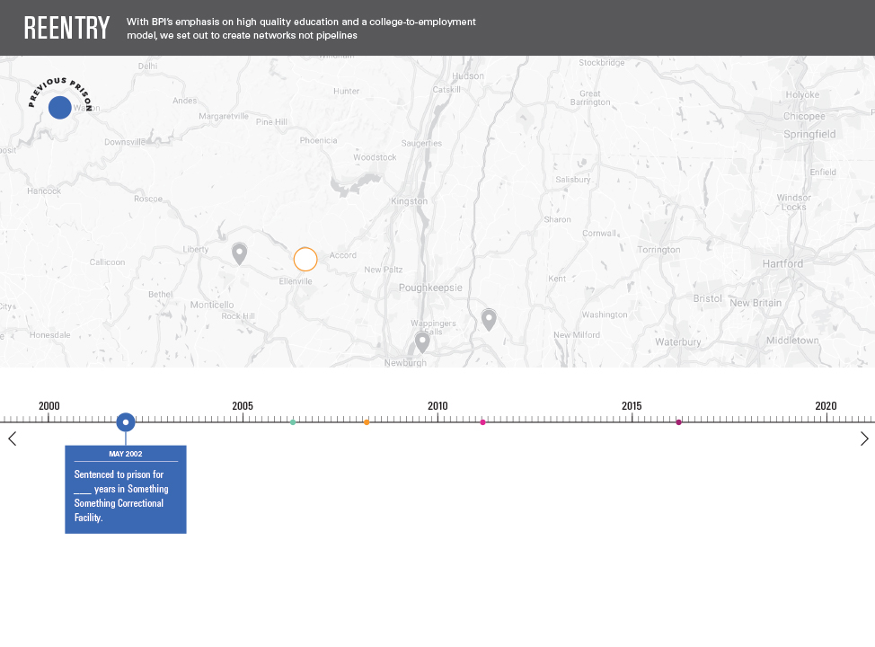
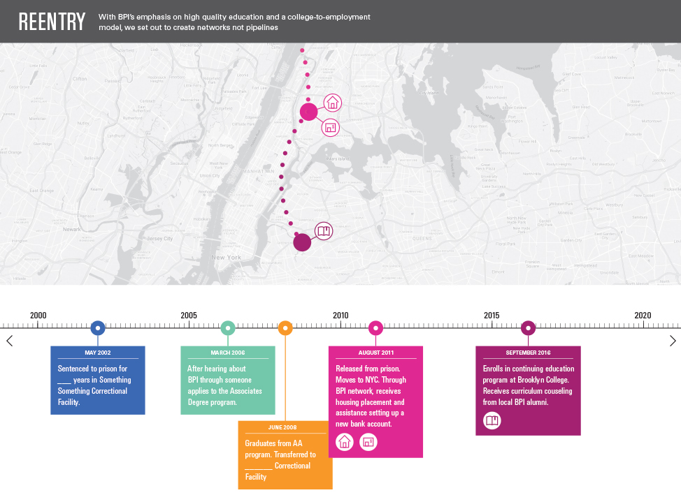
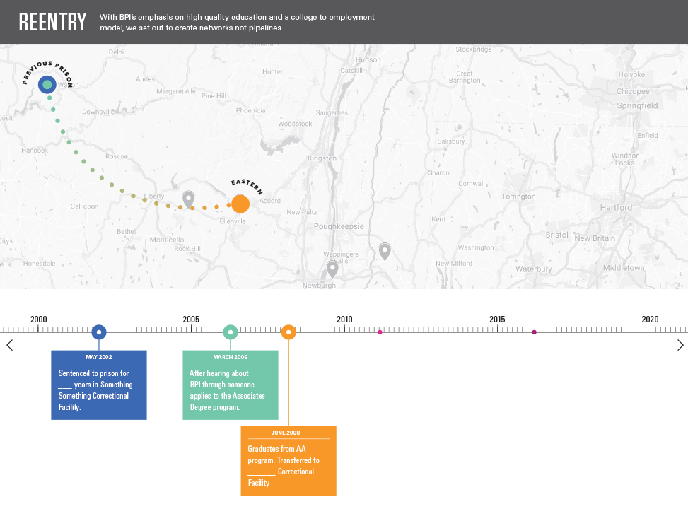
Before we had any detailed data on students and their interactions with BPI, I sketched out how timelines, maps, icons, and the movement of fictional students from campuses to various boroughs in New York may work together with user interaction to tell a full story.
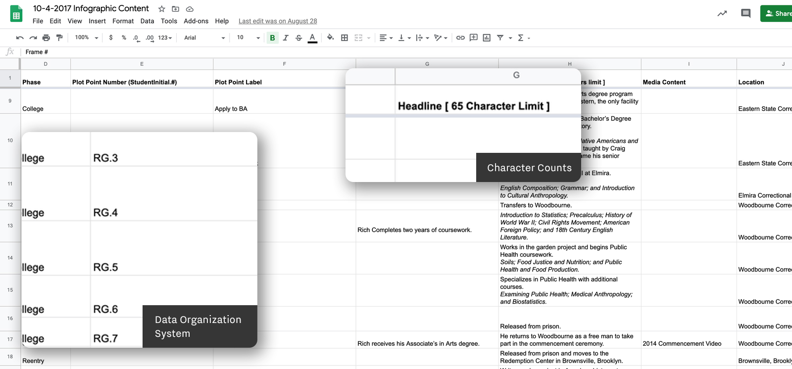
Once the client had provided several student timelines, I organized and edited the data for each event into distinct content areas that would used to make the overall graphic.
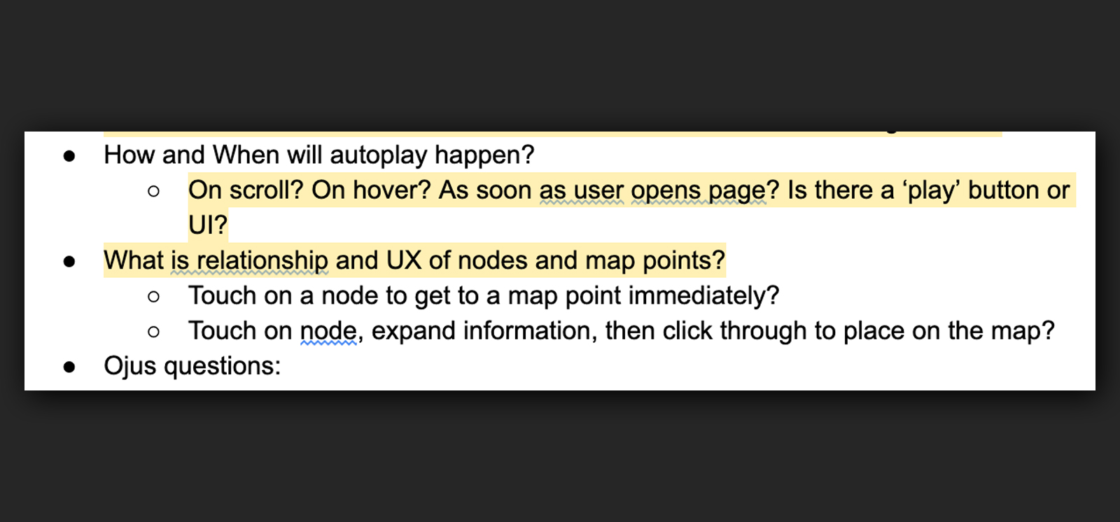
I also initiated conversations with both the developers and animators to iron out and narrow down options for the user experience.
I also initiated conversations with both the developers and animators to iron out and narrow down options for the user experience.
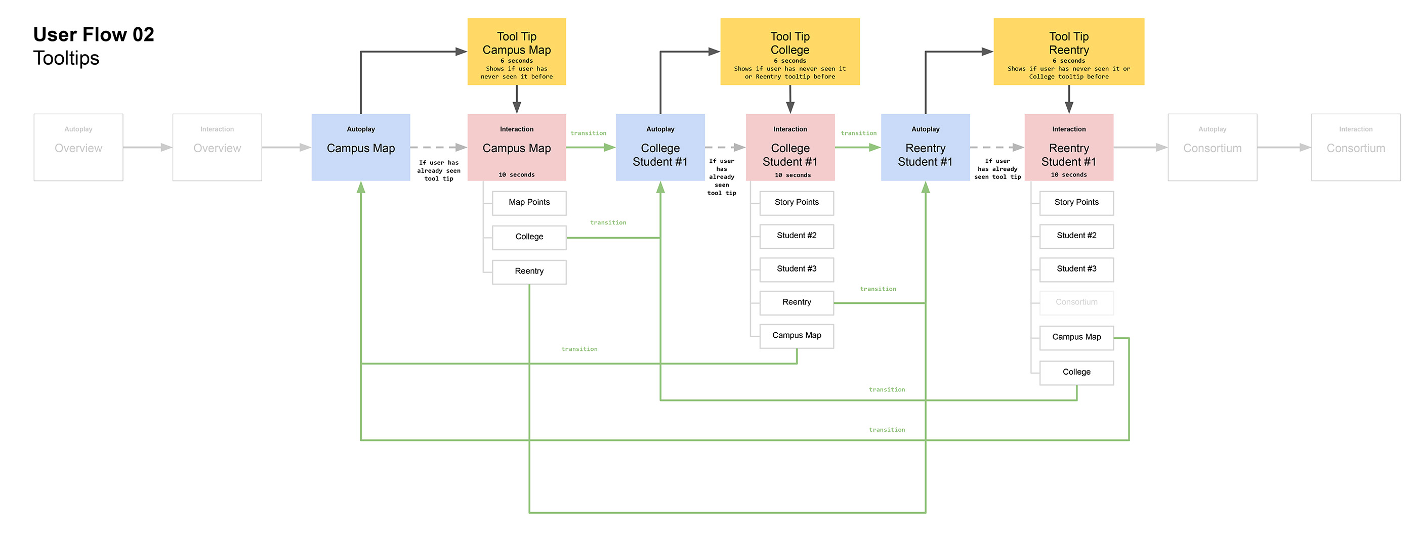
I translated these conversations and meetings into detailed user flow maps so that all team members understood and could visualize how the graphic would need to work.
Production Process
My main role was to expand wireframes and storyboards into a working prototype and eventually the main artwork files.
We used InVision to test out the concept and present it to the client as a proof of concept.
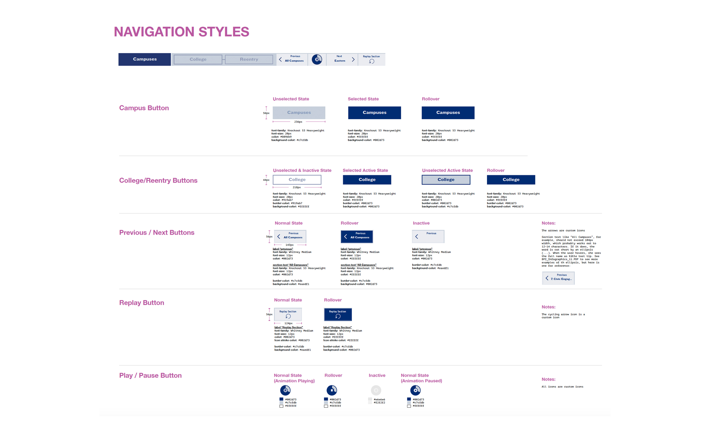

Later, I created a detailed style guide as well as artwork for every story point to aid the digital animators and developers in creating the final product to precise specifications.
Other Roles
As part of a small team that was juggling multiple clients and projects, I had to step into other roles over the course of the project in order to keep it moving on the right track.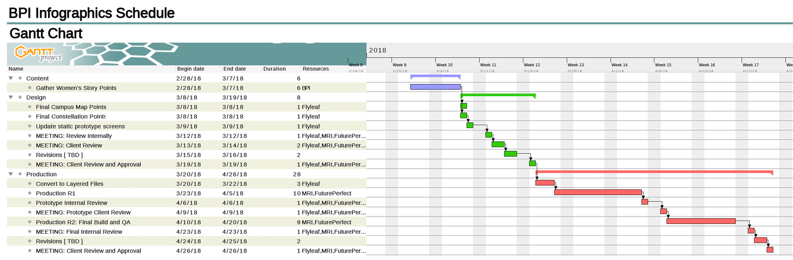
Additional roles included project management (I used a free tool called Gantt Project)
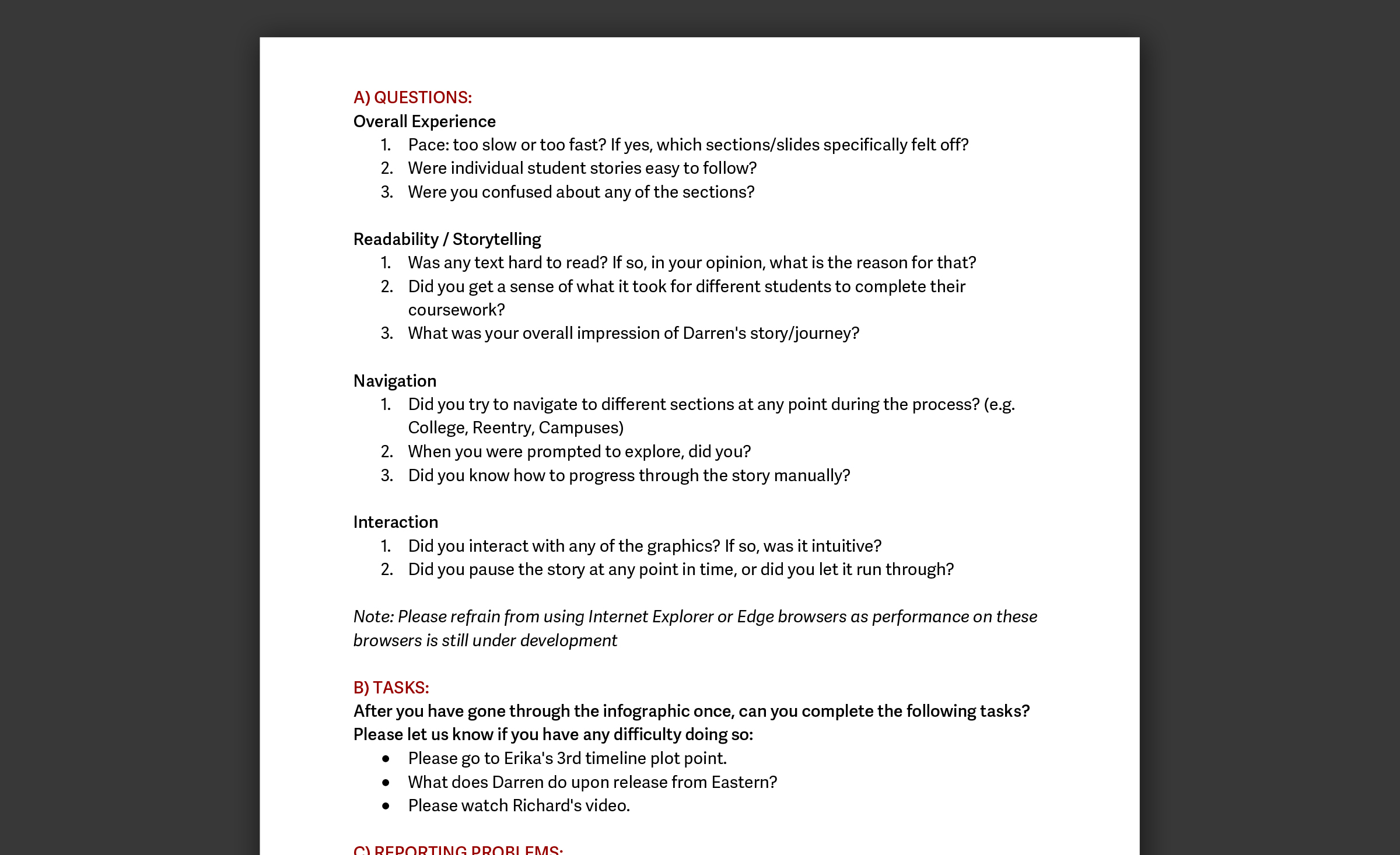
I also drafted user testing documentation. Although it is not my area of expertise, I consulted Erika Hall’s Just Enough Research as a good starting point.
Applications
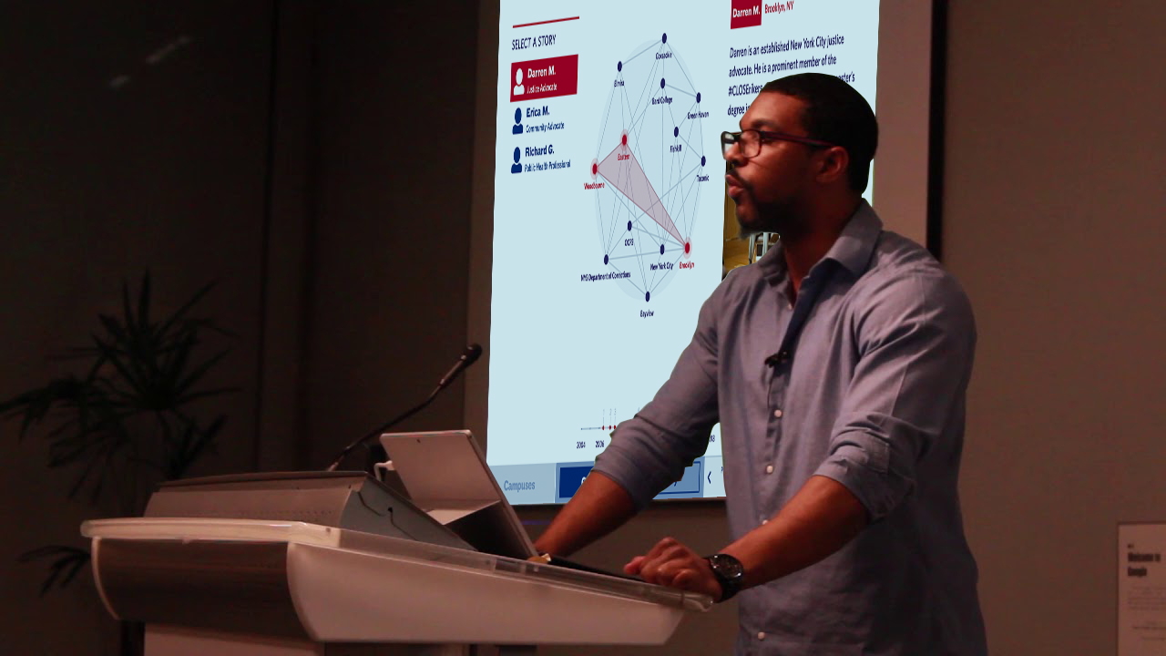
The final graphic currently lives on BPI’s website. In the course of developing and conceptualizing the graphic, both our team and the client started to realize just how powerful of a visual aid something like this could be. In the future, we envision the graphic living in multiple places, devices, and contexts. It can be expanded in functionality and depth of content to present a truly dynamic view of the impact of BPI and its alumni.