Lavelle Fund for the Blind
Visual Identity & Website
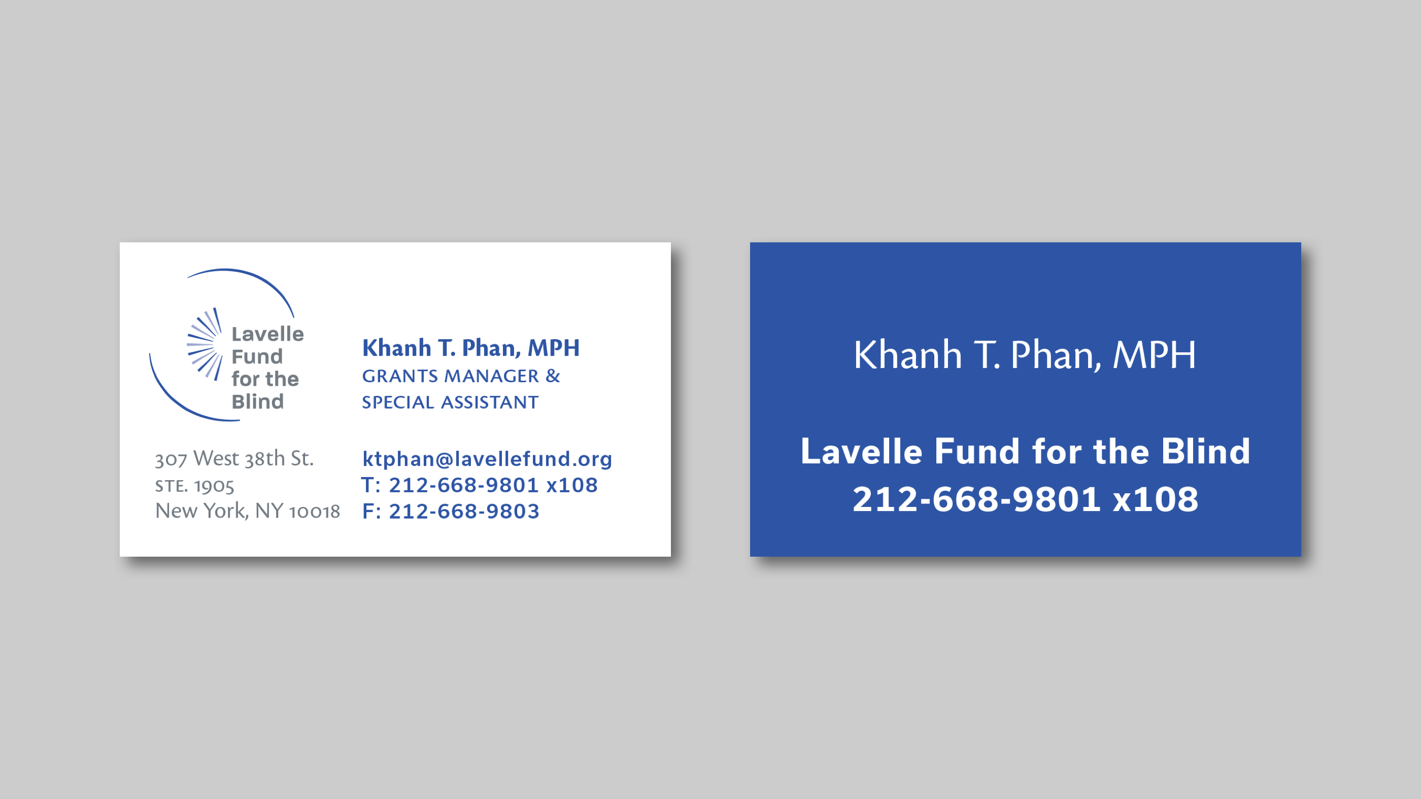
Branding + Website Design ︎ 2018The Lavelle Fund for the Blind is a foundation dedicated to providing grants and resources to organizations helping the visually impaired community mostly in the New York Tri-state area. We were tasked with giving them a formal visual identity along with new stationary and a comprehrensive redesign of their website. The mark and typography try to balance two contrasting feelings that embodied the foundation’s work: organic / nurturing / supportive + solid / simple. The mark accomplishes this by using curved lines that vary in stroke width complemented by strong geometric forms of square and circle. The color palette and typeface (Rian Hugh’s Paralucent) place the organization well within the medical and vision care realms, and especially respects the visual contrast needed for their constituents.
Completed while at:
Flyleaf Creative
Role:
Brand Research, Competitive Analysis, Design
Collaborators:
Valentina Vergara
Typefaces:
Paralucent
Usual
Cronos Pro
Flyleaf Creative
Role:
Brand Research, Competitive Analysis, Design
Collaborators:
Valentina Vergara
Typefaces:
Paralucent
Usual
Cronos Pro


Website
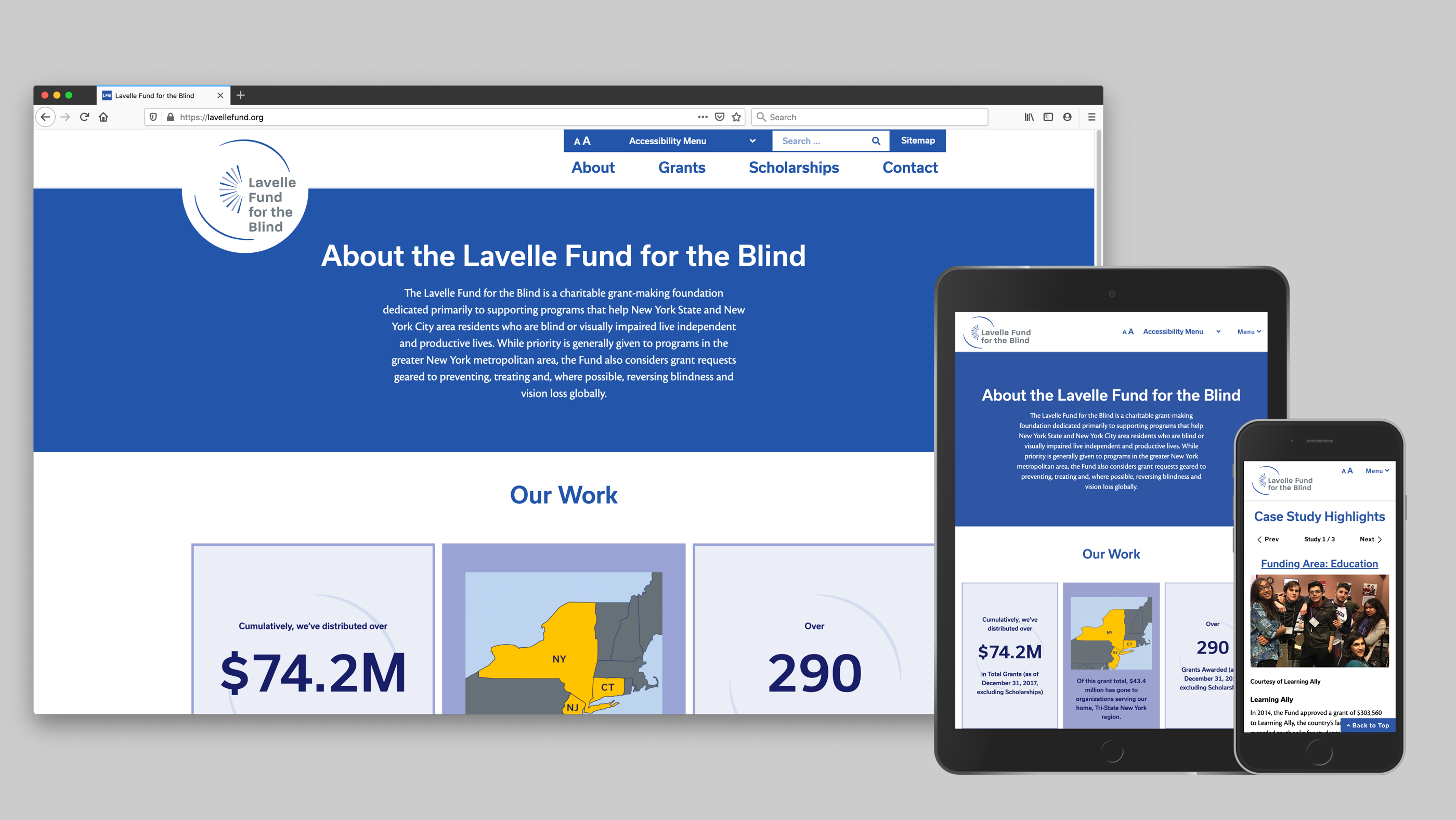
The website underwent a substantial overhaul in communicating the funds reach, impact, and presence among similar organizations. The website meets stringent WCAG accessibility guidelines, featuring a comprehensive Accessibility Menu to enable users to change several aspects of the site’s visual presentation to suite their needs. Complementing the visual identity, we chose a humanist body typography (Robert Slimbach's Cronos Pro) and strong sans-serif headline typeface (Rui Abreu’s Usual). And functionally, we upgraded the organization and UX of viewing and searching for awarded grants. Case study coming soon.


